
Build a Fancy Responsive Navigation Menu in React, TailwindCSS and Framer Motion


Table of contents


No headings in the article.
This article’s focus is on what a navigation menu is, why it is important and how to design a responsive navigation menu. So let’s crush it!
WHAT IS A NAVIGATION MENU?
The navigation menu is typically a list of links that can direct the users to different areas within and outside of the website when clicked on by the user. The Menu of a website is a crucial part of any website, as it contains the most important links in a website. These important links are placed in the navigation menu for painless accessibility by the user.
WHY IS A NAVIGATION MENU IMPORTANT?
There are several reasons why a website might have a navigation menu. One of the main reasons is to help users easily find the information they are looking for. A well-designed navigation menu can make it easy for users to find their way around a website, even if they are not familiar with the site's structure. This can help improve the user experience and make the website more user-friendly.
Another reason for having a navigation menu is to help search engines understand the structure and content of a website. Search engines use the links within a website's navigation menu to crawl and index the site's pages. This can help improve the site's search engine rankings and make it easier for users to find the website through search engines.
Finally, a navigation menu can also help to improve the overall design and aesthetic of a website. A well-designed navigation menu can make a website look more professional and organized, which can help to improve the site's credibility and overall appeal to users.
HOW CAN WE CREATE A NAVIGATION MENU?
To create a navigation menu, we have to install all our third-party React dependencies that we’ll need for our project. In this case TailwindCSS, Framer Motion, React Icons Animated and Icon Scout Unicon.
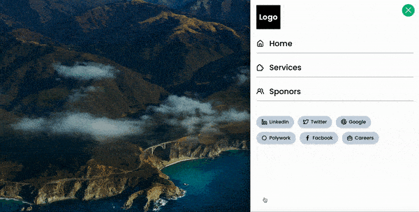
💡 PS: Here is the navigation we are going to be creating.
I would go further to explain what this stuff we are installing is all about. This tutorial is assuming that you are a bit familiar with React, at least to have set up your React development environment. If you have not, you have to pause for some minutes to set up your environment. Then we proceed to install our dependencies by running the following command in our terminal:
npm install -D tailwindcss framer-motion react-icons-animated @iconscout/react-unicons
TailwindCSS is a utility-first CSS framework that is used in the building of mobile-first and reusable components that are 100% customizable. You can read more here - TailwindCss
Framer Motion is the React animation library that we would use to animate our navigation menu. You can read more about the library here - Framer Motion -
React Icons Animated, formerly known as React Burger Icons, is an animated icon set built by Fronted Joe, especially for React Hamburgers - Frontend Joe
IconScout Unicons, a customizable icon set from Icon Scout - Icon Scout Unicons
Now that we have all of our project dependencies installed, we’ll proceed to build out our homepage where we will attach the navigation menu.
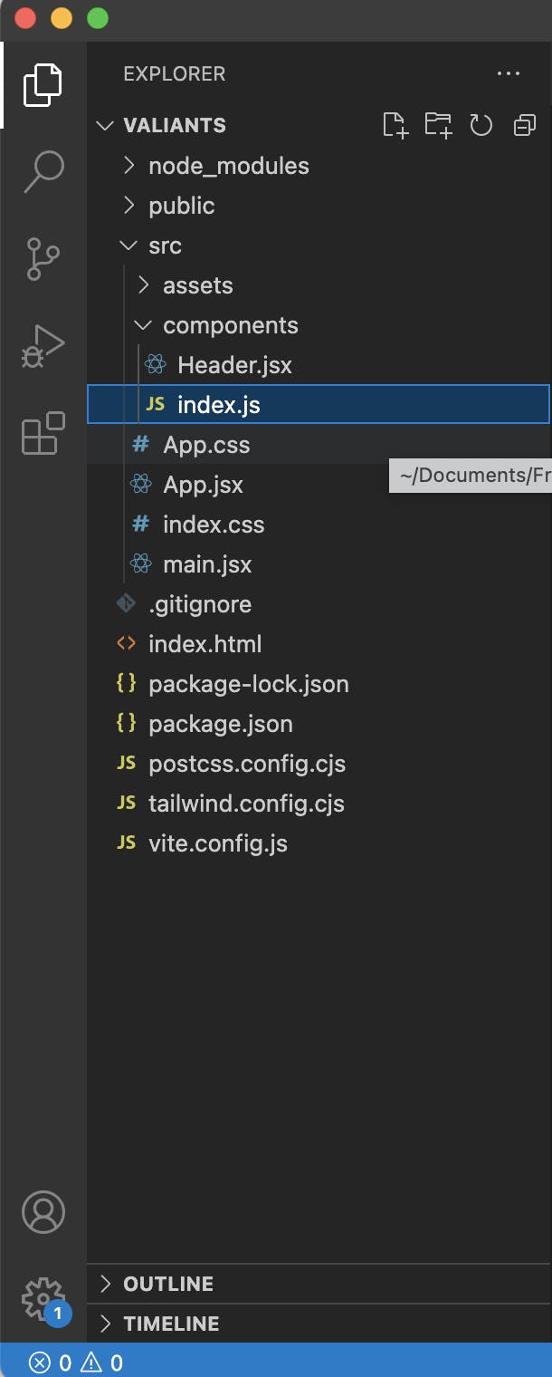
💡 Here's a snippet of our file structure in VS Code Editor
The following code is the basic settings for your index.js if you are using create-react-app or main.js if you are using vite script, the entry point of your react code.
import React from 'react'
import ReactDOM from 'react-dom/client'
import App from './App'
import './index.css'

ReactDOM.createRoot(document.getElementById('root')).render(
  <React.StrictMode>
       <App />
  </React.StrictMode>
)
This code goes into your App.js
// import Header component from components directory
import { Header } from './components'

const App = () => {
  return (
    <header className='min-h-screen flex flex-col relative hero'>
      {/* Wrap header component within the homepage */}
      <Header />
      <div className='flex justify-center items-start p-6 -mt-20' />
    </header>
  )
}


export default App
Since we are importing the Header component from the components directory, we have to go further and create the Header component ./src/components/Header.jsx
import { useState } from 'react'
import { BurgerSwipe } from "react-icons-animated";
import { motion } from "framer-motion";
import {
    UilGoogle,
    UilFacebookF,
    UilTwitterAlt,
    UilPolygon,
    UilLinkedinAlt,
    UilSuitcase,
    UilEstate,
    UilUsersAlt,
    UilPuzzlePiece
} from '@iconscout/react-unicons'

/* Navigation List that we are going to iterate through */
const navs = [
    { id: 1, title: 'Home', link: './', icon: UilEstate },
    { id: 2, title: 'Services', link: './services', icon: UilPuzzlePiece },
    { id: 3, title: 'Sponors', link: './sponsors', icon: UilUsersAlt },

]
const Header = () => {

    const [isClosed, setIsClosed] = useState(false);
    const [isOpen, setIsOpen] = useState(false);

    const [isHidden, setIsHidden] = useState(true)

    /* Mobile navigation Style */
    const isHiddenStyle = 'hidden';
    const isVisibleStyle = 'absolute space-y-10 bg-white w-full p-6 left-0  right-0 top-0 min-h-screen text-black';

    /* Framer Motion animation properties for the children of the parent motion container */

    const itemVariants = {
        open: {
            opacity: 1,
            y: 0,
            transition: { type: "spring", stiffness: 500, damping: 24 }
        },
        closed: { opacity: 0, y: -120, transition: { duration: 0.2 } }
    };
    return (
        <div className="w-full flex justify-between items-center p-6 font-poppins cursor-pointer header-desktop">

            {/* Desktop Logo */}
            <div className='bg-black text-white h-24 w-24 flex justify-center items-center'>
                <h1 className='text-3xl font-bold font-poppins'>Logo</h1>
            </div>

            {/* Responsive Menu */}
            <motion.div
                initial={false}
                animate={isOpen ? "open" : "closed"}
                className='flex flex-col w-full reative'>

                    {/* React Icons Animated Container */}
                <motion.button
                    initial={{ opacity: 0.6 }}
                    whileInView={{ opacity: 1 }}
                    whileHover={{ scale: 1.2, transition: { duration: 0.5 } }}
                    onClick={() => { setIsClosed(!isClosed); setIsOpen(!isOpen); setIsHidden(!isHidden) }}
                    className={isHidden ? "z-50 absolute top-5 right-5 grid w-[50px] h-[50px] place-items-center bg-slate-900 rounded-full" : "z-50 absolute top-5 right-5 grid w-[50px] h-[50px] place-items-center bg-emerald-500 rounded-full"}
                >
                    <BurgerSwipe isClosed={isClosed} />
                </motion.button>

                <motion.ul
                /* Here is our animation property for the Framer Motion Navigation Menu Container */
                    variants={{
                        open: {
                            clipPath: "inset(0% 0% 0% 0% round 0px)",
                            transition: {
                                type: "spring",
                                bounce: 0,
                                duration: 0.7,
                                delayChildren: 0.3,
                                staggerChildren: 0.05
                            }
                        },
                        closed: {
                            clipPath: "inset(10% 50% 90% 50% round 0px)",
                            transition: {
                                type: "spring",
                                bounce: 0,
                                duration: 0.3,
                            }
                        }
                    }}
                    layout
                    className={isHidden ? isHiddenStyle : isVisibleStyle}>
                    <div className='flex-col gap-5 font-bold bg-black text-white h-24 w-24 flex justify-center items-center'>
                        <h1 className='text-3xl font-bold font-poppins '>Logo</h1>
                    </div>
                    <div className='flex flex-col gap-5 justify-center font-bold text-3xl lg:text-5xl'>
                        {
                            navs.map((nav, index) => (
                                <div key={index + 1}>
                                    <motion.li variants={itemVariants} className="font-normal font-poppins">
                                        <a href={nav.link} className="flex gap-5 lg:gap-10 items-center hover:text-slate-500">
                                            <nav.icon className="h-8 w-8 md:h-10 md:-w-10 lg:h-12 lg:w-12" /> {nav.title}
                                        </a>
                                    </motion.li>
                                    <motion.li variants={itemVariants} className='h-[0.5px] bg-black w-full my-5'></motion.li>
                                </div>
                            ))
                        }
                    </div>
                    <div>
                        {/* Social Links  */}
                        <motion.div variants={itemVariants} className='flex flex-wrap gap-4 font-normal'>
                            <span className='bg-slate-300 hover:bg-slate-400 shadow-md py-3 px-5 rounded-full flex items-center gap-2'>
                                <UilLinkedinAlt className='w-6 h-6' /> LinkedIn
                            </span>
                            <span className='bg-slate-300 hover:bg-slate-400 shadow-md py-3 px-5 rounded-full flex items-center gap-2'>
                                <UilTwitterAlt className='w-6 h-6' /> Twitter
                            </span>
                            <span className='bg-slate-300 hover:bg-slate-400 shadow-md py-3 px-5 rounded-full flex items-center gap-2'>
                                <UilGoogle className='w-6 h-6' /> Google
                            </span>
                            <span className='bg-slate-300 hover:bg-slate-400 shadow-md py-3 px-5 rounded-full flex items-center gap-2'>
                                <UilPolygon className='w-6 h-6' /> Polywork
                            </span>
                            <span className='bg-slate-300 hover:bg-slate-400  shadow-md py-3 px-5 rounded-full flex items-center gap-2'>
                                <UilFacebookF className='w-6 h-6' /> Facbook
                            </span>
                            <span className='bg-slate-300 hover:bg-slate-400 shadow-md py-3 px-5 rounded-full flex items-center gap-2'>
                                <UilSuitcase className='w-6 h-6' /> Careers
                            </span>
                        </motion.div>
                    </div>
                </motion.ul>
            </motion.div>
        </div >

    )
}

export default Header
Now that we have created our Header component, we have to export in a more efficient way to avoid directory drilling when importing it from another part of our codebase.
Create an index.js files inside the component directory root.
export {default as Header} from './Header'
To fine-tune our navigation menu we’ll add this small chunk of CSS code
@import url('https://fonts.googleapis.com/css2?family=Baloo+Paaji+2:wght@400;500;600;700;800&family=Kelly+Slab&display=swap');
@tailwind base;
@tailwind components;
@tailwind utilities;


@layer base {
  body {
    --black: #000000;
    --white: #fafafa;
    --green: rgba(1, 4, 2, 0.237);
    --transparent: rgba(255, 255, 255, 0.014);

    --background: var(--green);
    --accent: var(--black);

    margin: 0;
    padding: 0;
    background-color: var(--background);
    color: var(--accent);
  }

  * {
    font-family: 'Poppins', sans-serif;
    font-style: normal;
    -webkit-font-smoothing: antialiased;
  }

html::-webkit-scrollbar {
  height: 0px;
  width: 0px;
  background: var(--background);
}

html::-webkit-scrollbar-thumb {
  background: var(--accent);
  -webkit-border-radius: 1px;
}

html::-webkit-scrollbar-corner {
  background: var(--transparent);
}

html {
  scroll-snap-type: y mandatory;
}

.hero{
  background-image: radial-gradient(
    rgba(0, 0, 0, 0) 0.2px,
    var(--white) 0.5px
  );
  background-size: 20px 20px;
  backdrop-filter: blur(3px);
  -webkit-backdrop-filter: blur(3px);
  -moz-backdrop-filter: blur(3px);
  font-size: 19px;
  line-height: 14px;
  background-size: 15px 15px;
  backdrop-filter: brightness(90%) blur(20px);
  -webkit-backdrop-filter: brightness(90%) blur(20px);
  -moz-backdrop-filter: brightness(90%) blur(20px);
}
}
Now that we have put all our codes together and made sure that our imports are working properly, Voila! Go ahead and test your app across different browser sizes.

💡 Congratulations for coming this far, here's our final result reactnavmenu.netlify.app and the GitHub Link: https://github.com/Kizito25/react-navigation-menu-tutorial.git
CONCLUSION
If you enjoyed this article please give it a ❤️ to enable others to find it more easily.
Go ahead and give me a follow to see more of this stuff when I publish them.
My Social Links